")


Websites. For some, it’s a sore subject. (Just check out my insta, they say… it’s way better!) For others, they absolutely can’t WAIT to show off their site. The bridge between the gap, (in my personal experience,) is having the knowledge and the know-how to choose the right showit website template for your photography business.
Now, if that statement confuses you at all, no worries. We’ll get into the meat and potatoes of it in just a sec!
To have a stellar website, you have two options. You could a) buy a stellar template and customize it yourself, or b) hire a designer to build you a custom site + brand.
Now, I’ve spent thousands and thousands of dollars on websites over the years. I’ve bought templates, (most of which I’ve never even used,) and I’ve also gone completely custom. However, if I’d have known what I know now… I’d have saved myself a ton of time, tears, and money.
So that’s my goal with you today, is to save you all of the above. (Yes, even money! Stay with me for a baller discount code.) ?
Both of the previous options have their advantages, but given the fact that this is probably your first legit website; I say skip the custom design and buy a template that’s strategically laid-out, and super (but also easily) customizable.
(Seriously. It’s not even my first legit site… and my current website is literally a customized version of the Cosmopolitan website template by Tonic Site Shop.)
Yes, I literally used a template from Tonic, after having invested over $5k on a completely custom website prior.
Why? Well, for a lot of reasons. But we’ll save that for another blog…
Moral of the story is, you cannot go wrong with investing in a strategically-built, beautiful Showit website template.
If you’re here, you probably already know about Showit. However, if you don’t, Showit is a drag-and-drop website builder that is INSANELY easy to use, and an absolute joy to customize. It’s actually the only website builder I highly recommend.
Now, let’s move onto the list of things to look for in a Showit website template, to help you best choose a Showit website template for your photography business.
1. The Showit template you choose for your photography business’ website needs to have the following pages:
– Home
– About
– Portfolio
– Services
– Information / details / investment
– Blog
– Contact
Some additional pages/canvases that would benefit you:
– Shop
– 404 Page
– Newsletter Opt-in
– Resources/Favorite things page
– Additional canvas/design options
Note: Some Showit designs are what are called a “landing page” style site. This just means it’s a one page website, where when you click each page in the menu, it simply “scrolls down” to that particular section. It doesn’t actually go to another page on the website, it just scrolls down to it. I DO NOT recommend this style for your photography business’ website.
2. The Showit template you choose for your photography business needs to have the following features on each page:
THE HOME PAGE:
As a photographer, I highly recommend having a large image that’s displayed front and center, right off the bat; that evokes a specific feeling — paired with your company’s tagline.
Having one of your images, as well as a powerful tagline above the fold — is like the cocktail for captivating your reader/potential client.
(And this doesn’t matter what type of photography style you have, whether it’s light & airy or dark & moody or photojournalistic, etc.) It seriously won’t matter! It’s just psychologically super effective.
Here is a PERFECT example of what I mean:
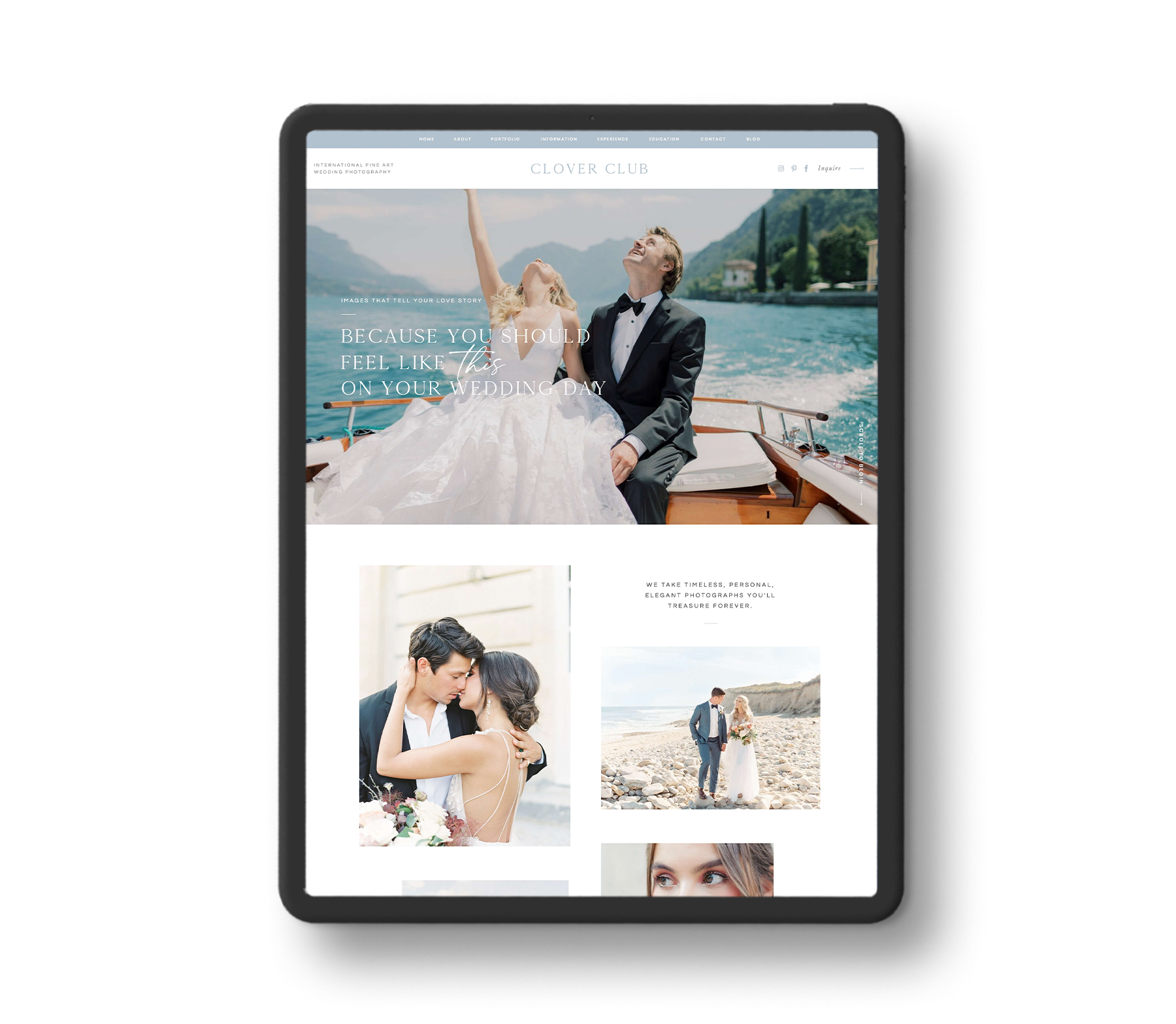
See how you have this large image, that evokes a sense of COMPLETE joy and excitement, (yet is also luxurious and adventurous,) and is combined with a powerful statement that evokes a feeling? It reads, “Images that tell your love story. Because you should feel like THIS on your wedding day.”
… And all the applause goes to… this web designer. *cue standing ovation* ??????
Moving on…
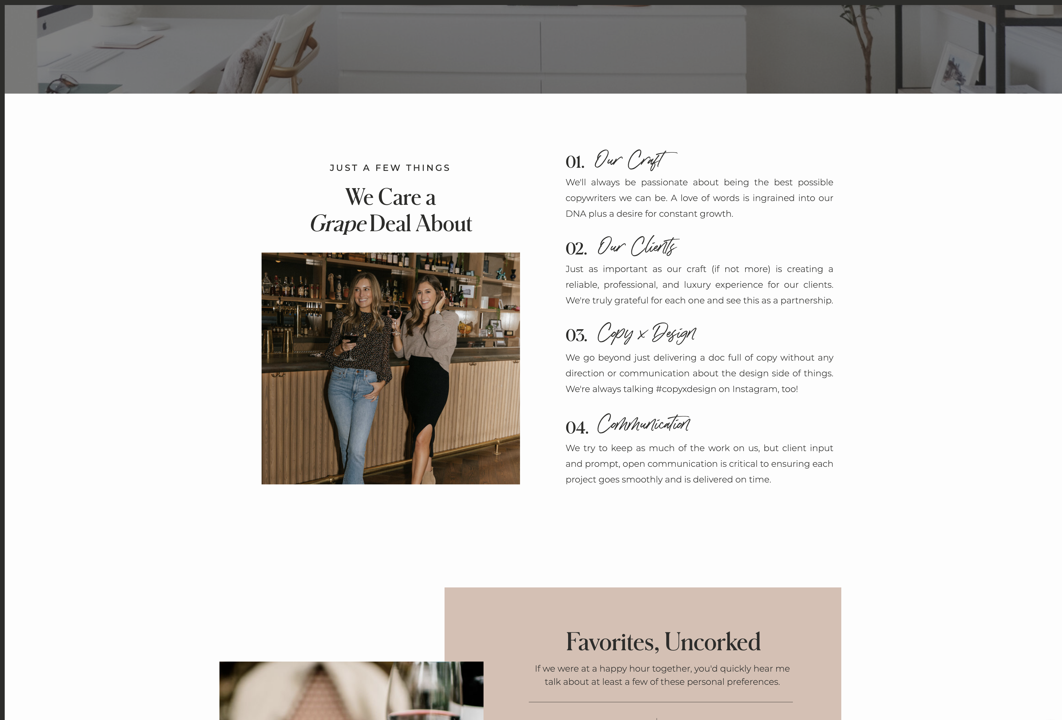
Next, we want a photo of you and a small, summed-up version of who you are, what you do,and why you do it. At the end of your “about me” blurb, have a button that links to your full about page, where people can go to read more.
Like this:
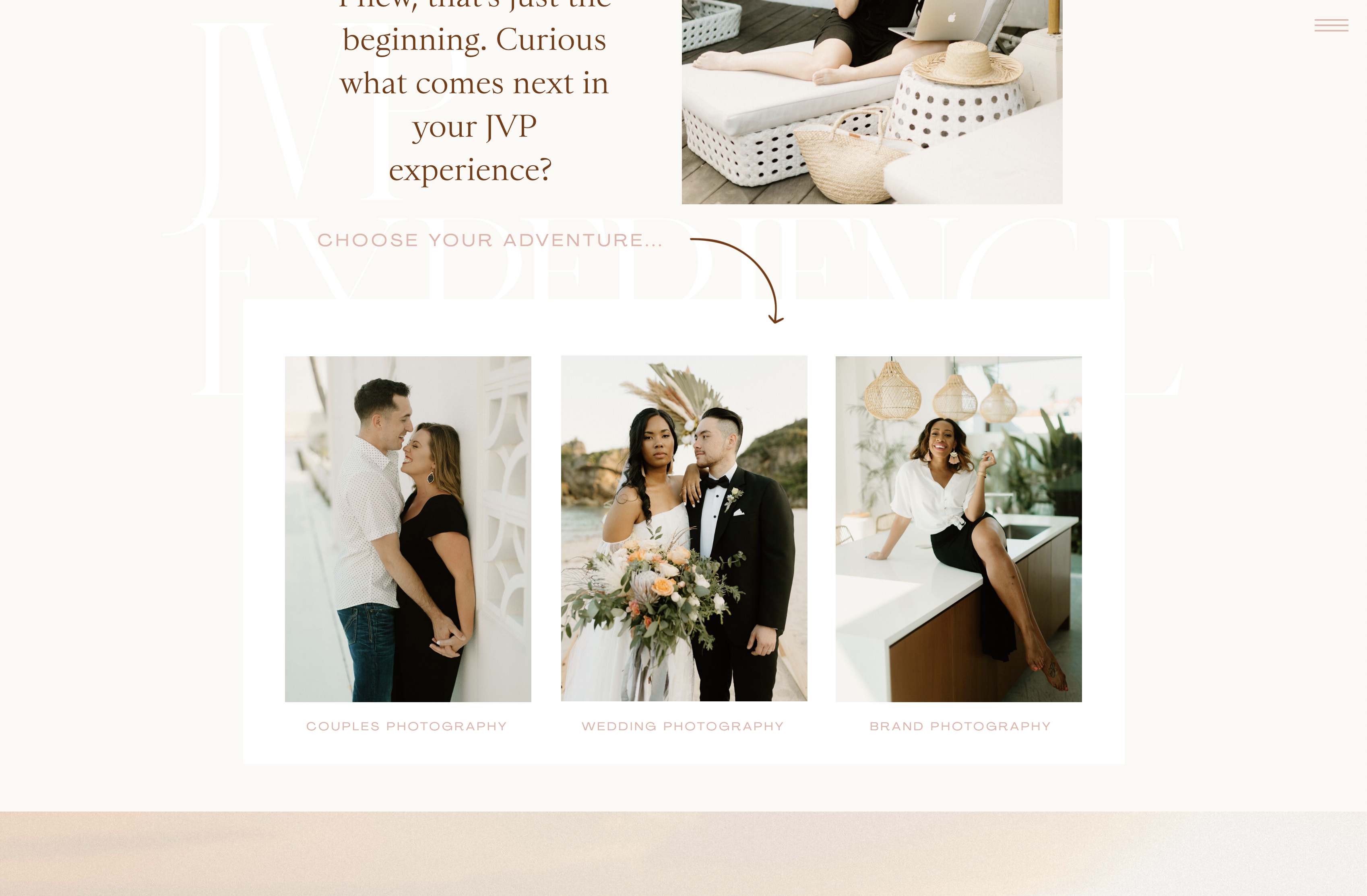
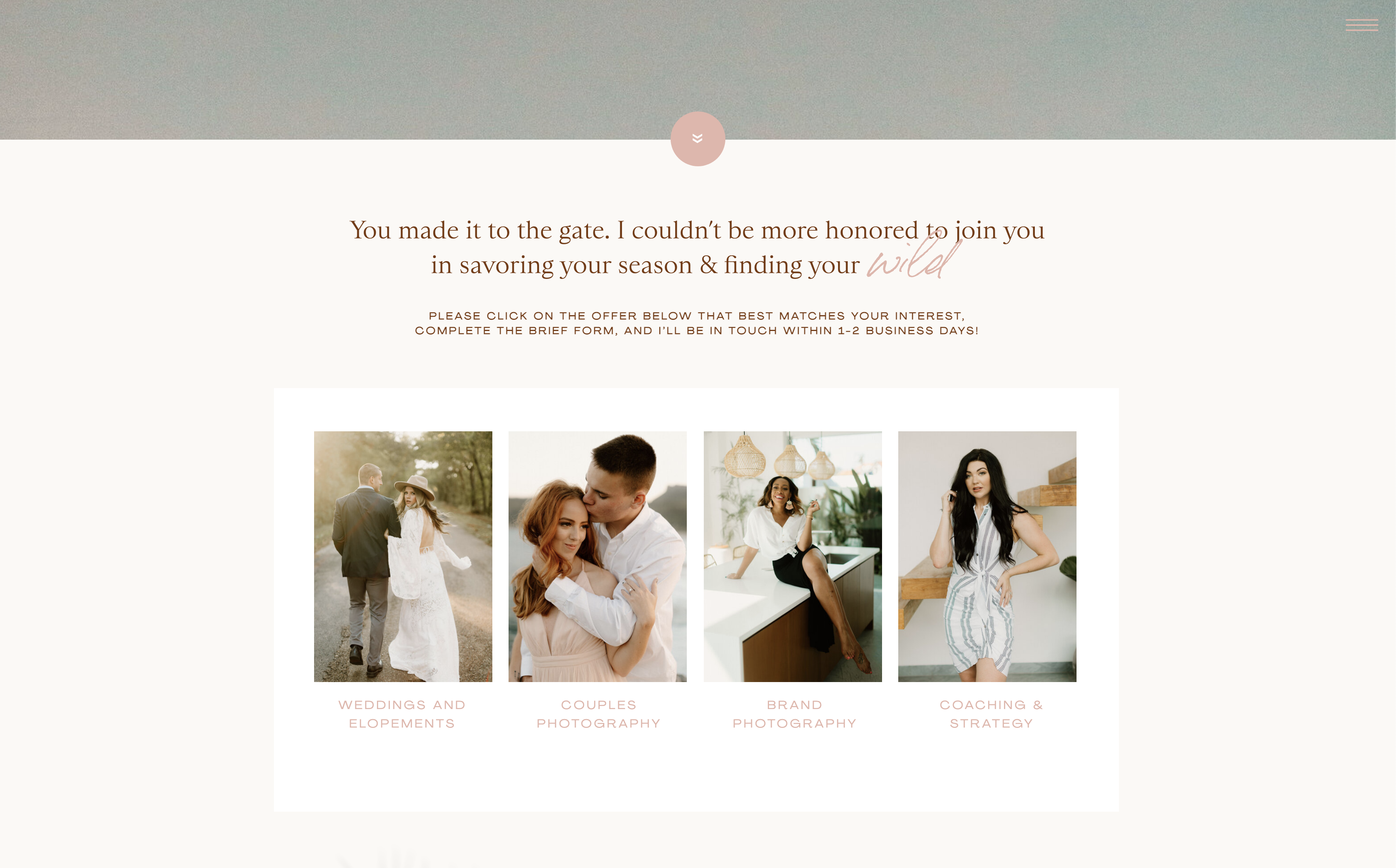
I then recommend having an option where people can self-segment, and choose the offer of yours that is most beneficial to them.
Whether that’s wedding photography, or couples photography, or brand photography, etc… have those as options; that then lead to individual sales pages for their respective offer.
It could look like this:
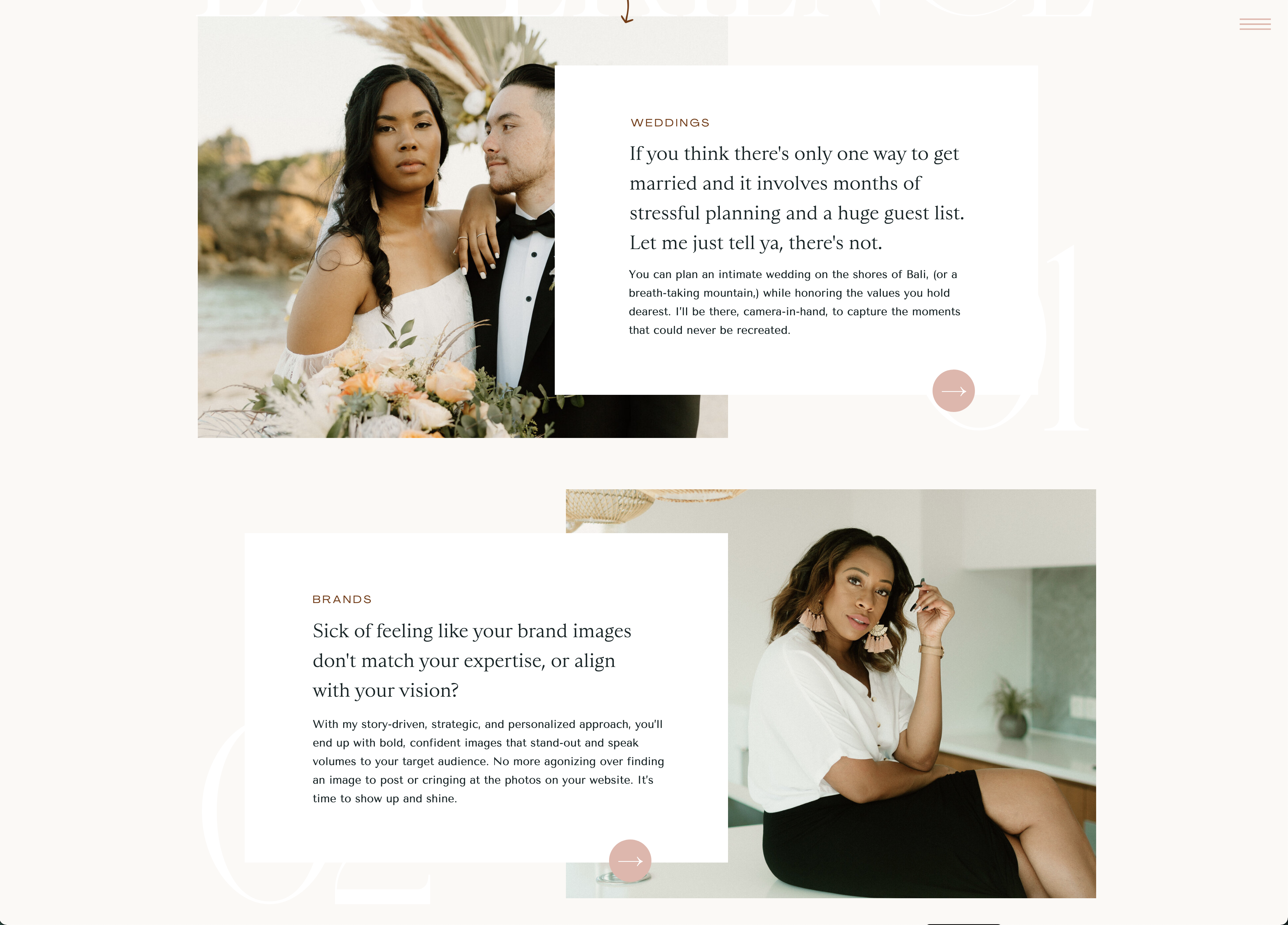
Or even something like this:
The possibilities are endless!
The next things that would be helpful to have on your home page, are canvases that showcase:
– Testimonials
– Your blog / recent blog posts
– An opt-in for your email list
– Places you’ve been featured/awards you’ve won
– Any other offers you’d like to feature
THE ABOUT PAGE:
– An image of you, and a short bio at the top. (Where you can then elaborate more on your heart/why/business, and then loop the reader into the story.)
(Pro tip: They (your potential client) should be the hero of your about page — not you!)
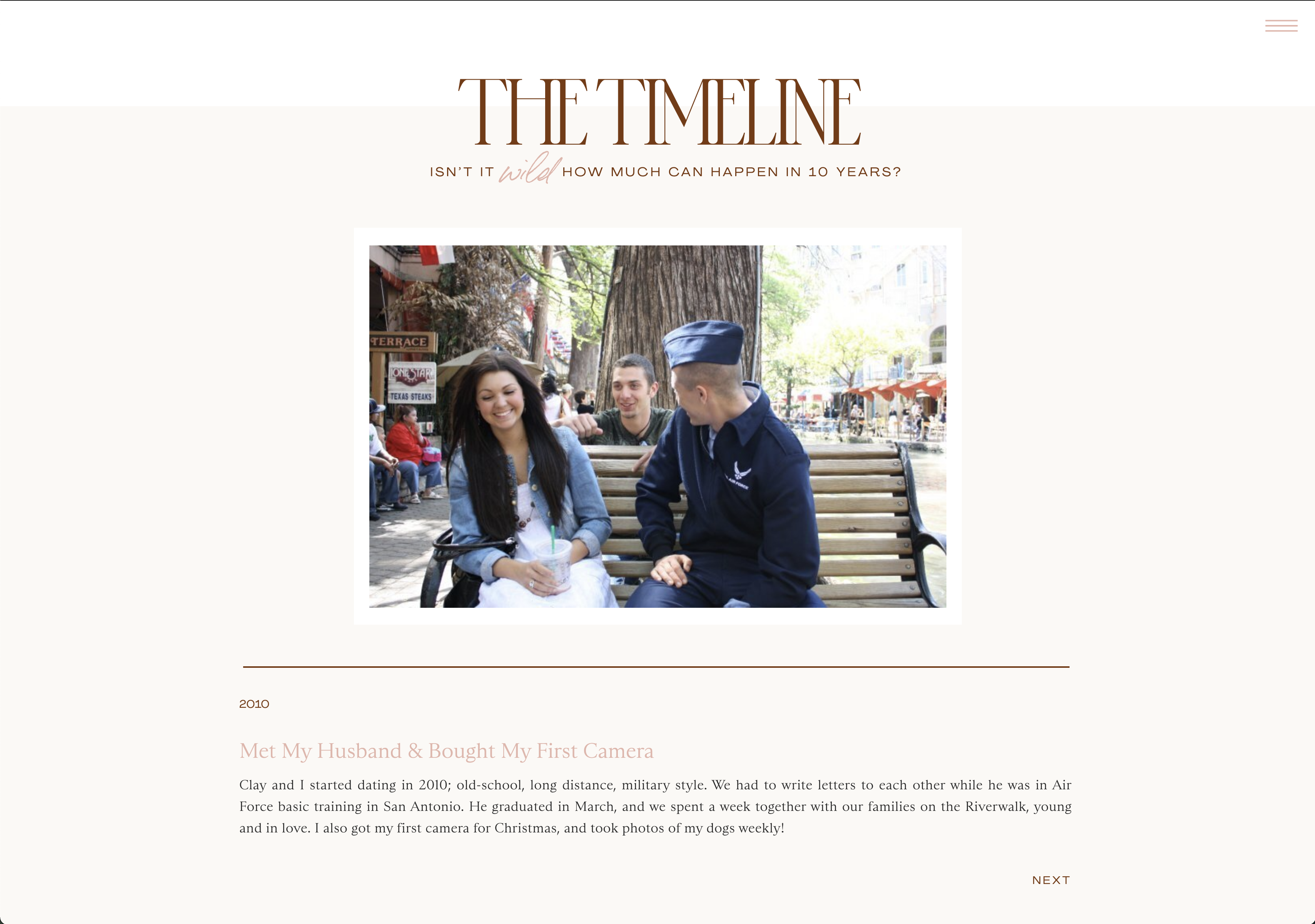
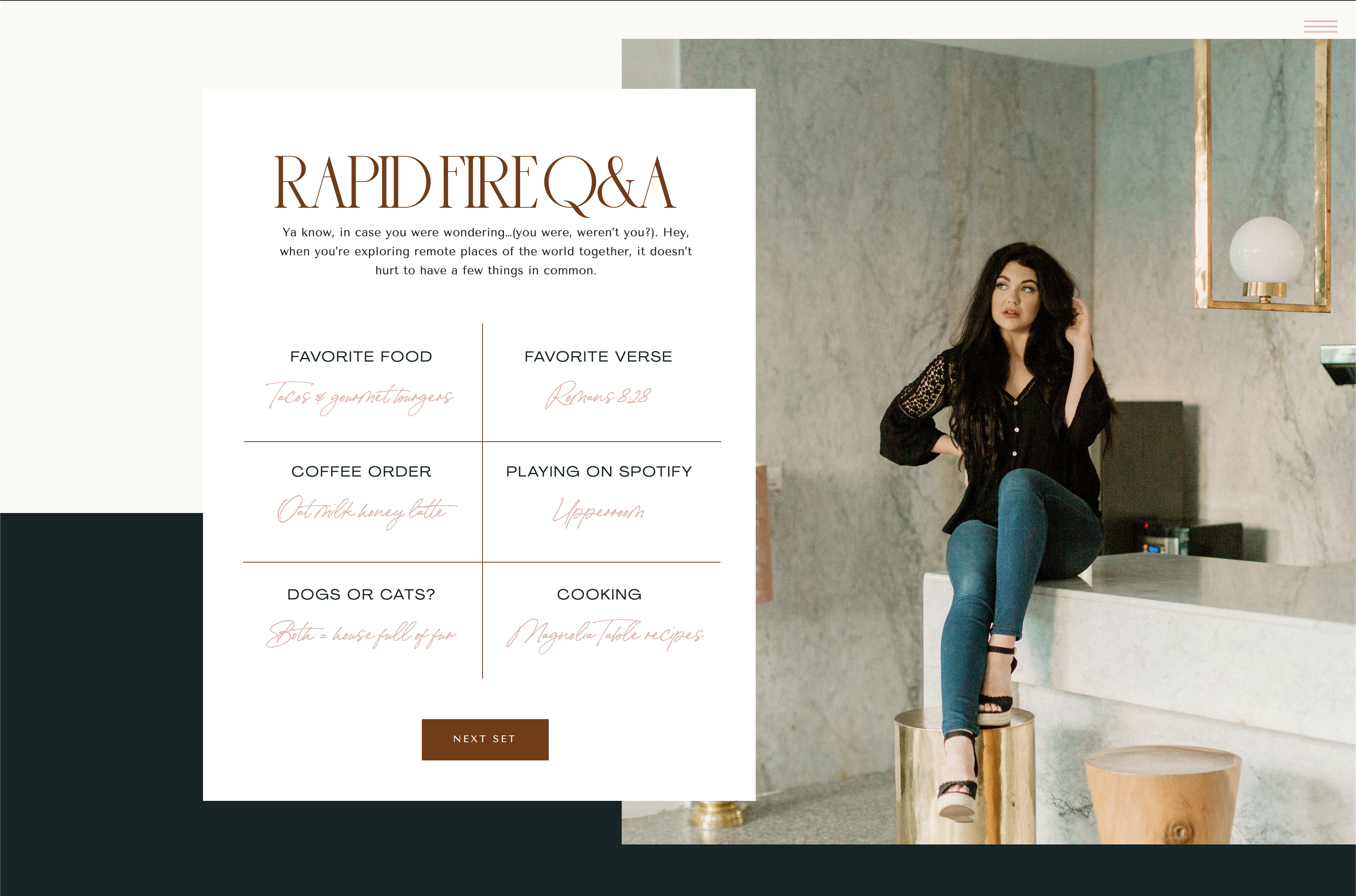
Some other fun elements I’ve seen utilized on about pages are:
– A timeline – this walks you through the years of the service provider’s (that’s you!) life, and gives you a BTS look of where they’ve been
– A Q&A section – this helps you get to know them even more, cosmo quiz style!
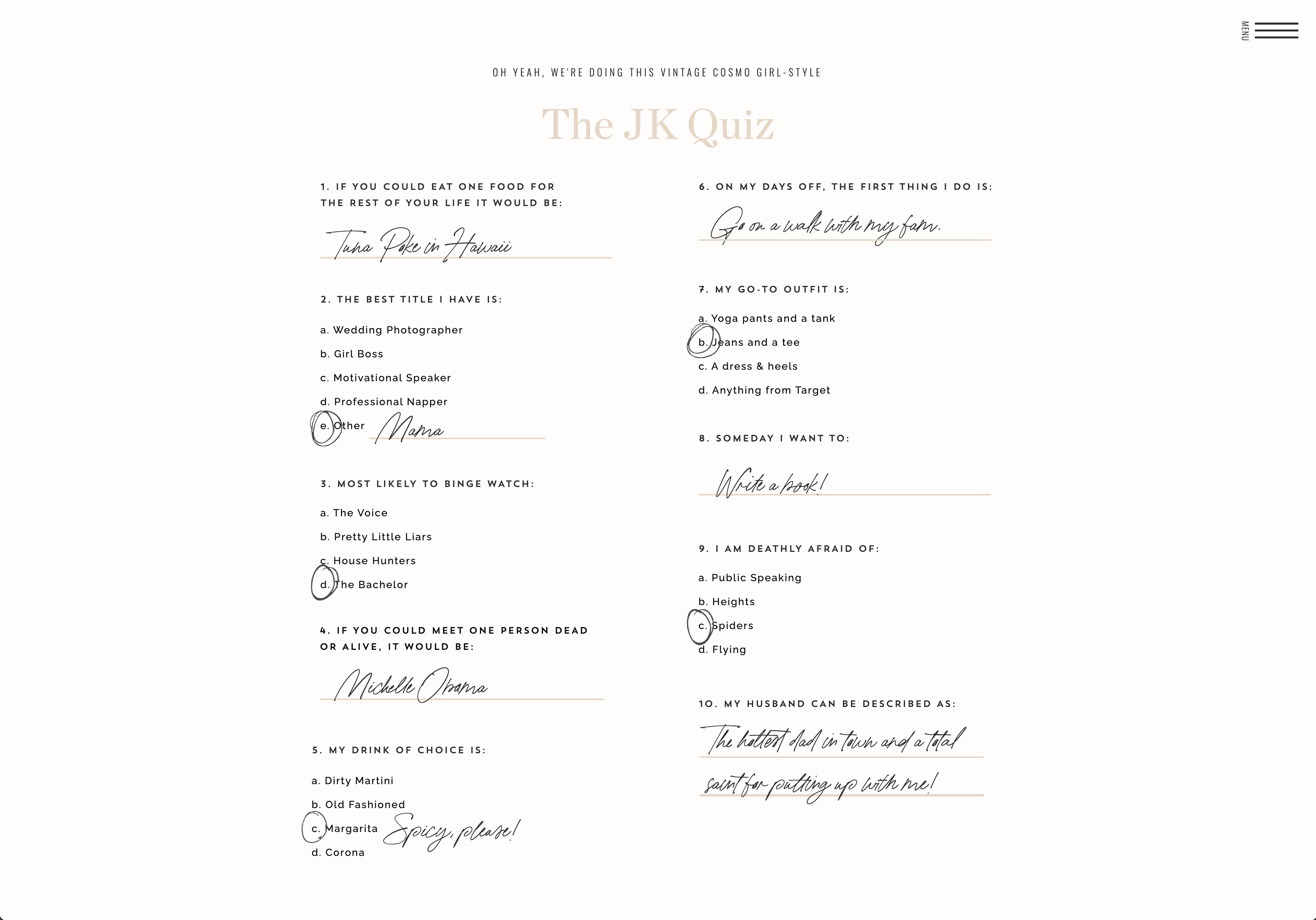
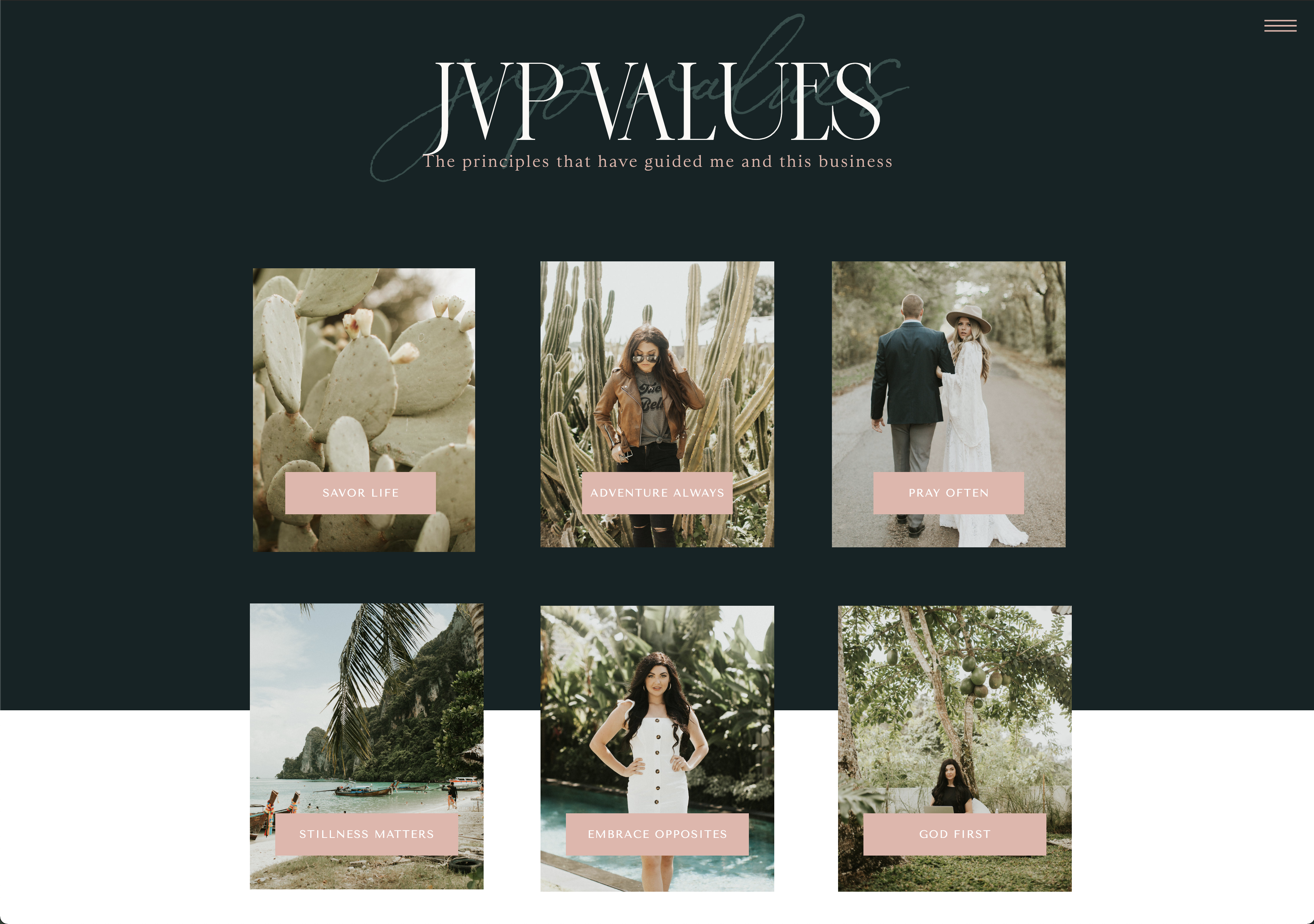
– Core values – these simply display what your business is about and what you/it stands for, and helps other people to have a “me too” moment in identifying with you!
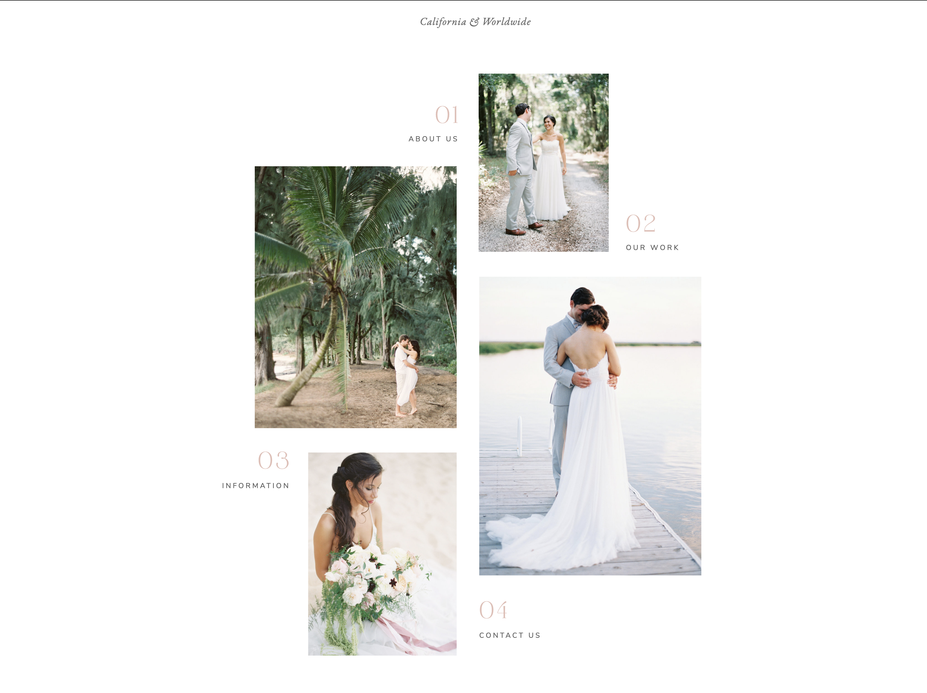
THE PORTFOLIO PAGE:
Of course, we as photographers need a portfolio page! This is where we’re showcasing all of our best work. Notice I didn’t say all of our work?
You only want to show what you want to shoot more of!
There are many different layouts for portfolios out there; but be sure to test drive the portfolio on the live demo of the showit website template to make sure you like it! Tonic Site Shop does a great job of designing templates that have 4-5 different portfolio page options, which is a DREAM.
Here’s an example of what I’m talking out! On the Cosmopolitan template’s portfolio page, you’ve got options for the following for portfolio layouts:
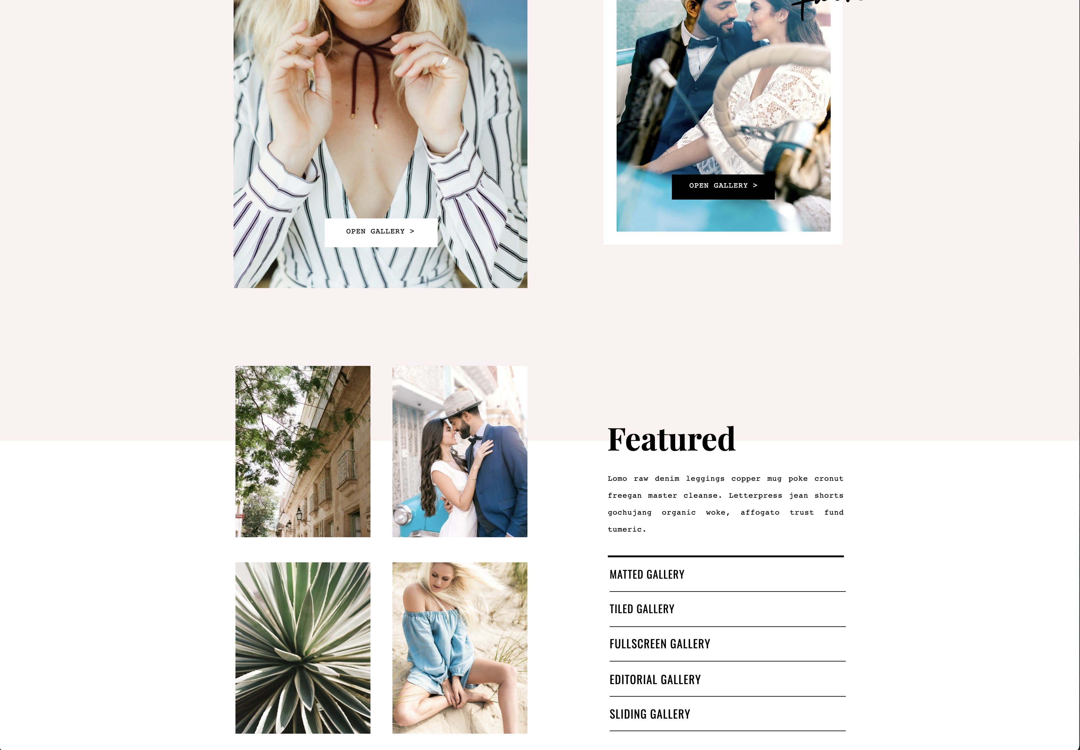
You’ll want to click through, and demo each one to see which you love best! (I went with the tiled gallery on my cosmo template!)
THE SERVICES PAGE:
You want to have a page that lists your services on it, where the reader can then “self-segment” themselves and go to the page that is specifically made for them.
Why not have them all on one?
Well, in copywriting there’s this thing called “the rule of one.” You always want to be speaking to one person, with one specific problem, and present them with one specific service at all times.
So having a page that just has three or so options on it, where you’re trying to sell to all of them… isn’t really the best idea for us as photographers.
Here’s what I mean:
See how you click the one that’s best for you, and then you follow that page to get to where you’re trying to go?
INFORMATION/DETAILS/INVESTMENT:
This is going to be your individual offer page. For example, my 1:1 coaching page here.
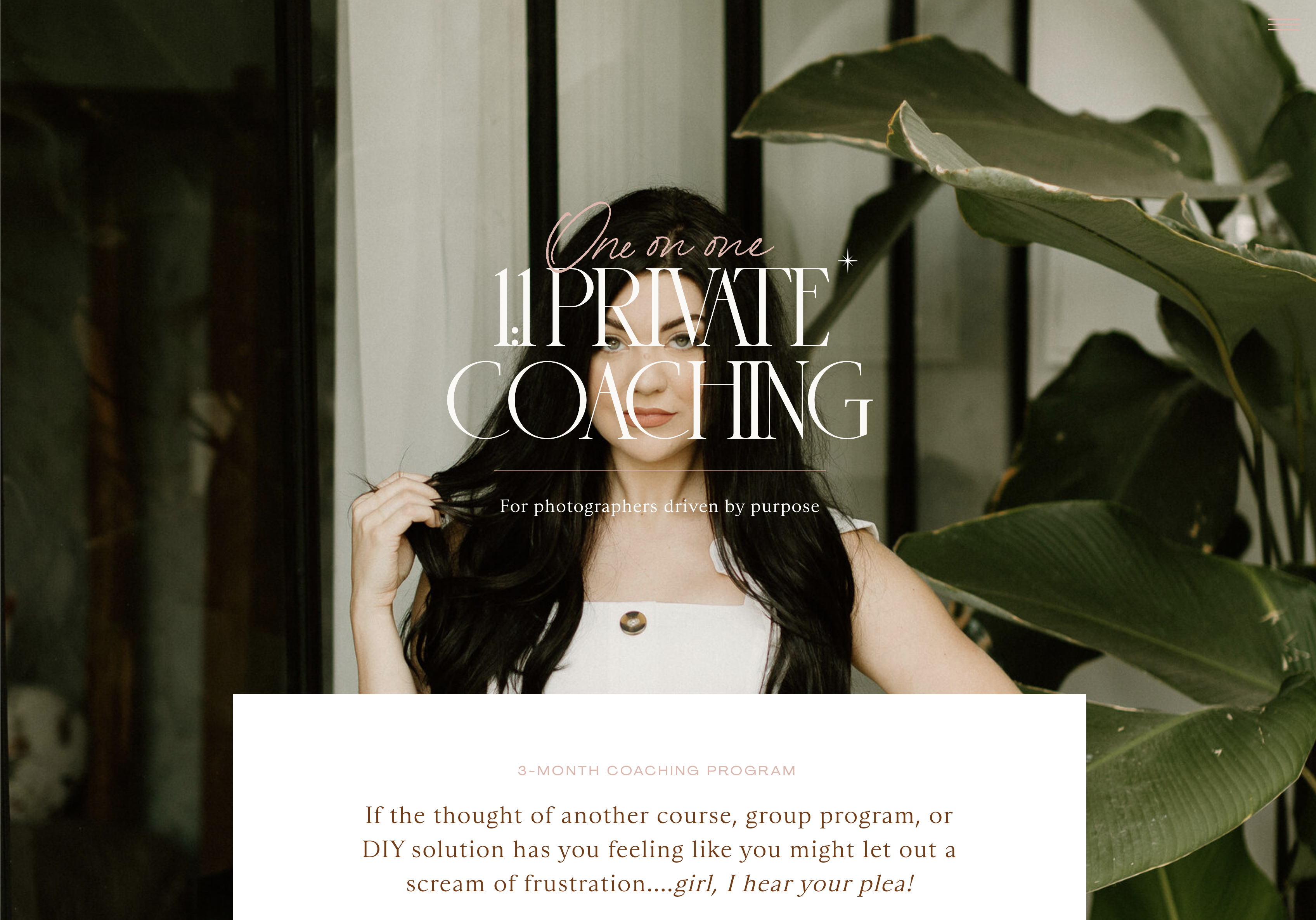
See how it has a bold statement at the very top that is speaking to one specific person?
This page is specifically geared towards photographers wanting coaching — that’s it. It’s not pitching to wedding clients, or brands, or couples. It’s just for photographers, so that’s why if you’re one of my ideal clients… it feels like it’s speaking directly to you! #conversioncopyforthewin
Some other things you’ll want on your individual offer/service pages:
– Who it’s for (qualifying them for the service)
– Who it’s not for (repelling who wouldn’t be a good fit)
– How it works (explain your process; it’s amazing if you can do it in 3’s)
– What’s included (for example, the collections)
– The investment (can also do just “starting at” prices if you’d like)
– The results it’ll get them
– Testimonials
– A CTA (call to actions) at the end of the page that points to the contact form for that particular service
My 1:1 coaching page, as well as any other individual service page on my website, has all of these things; so you can reference it as an example! 🙂
THE BLOG PAGE:
For the blog, it’s ideal to have a featured post that shows at the very top. Usually, this is your most recent blog post you’ve published! I love this example on the French 75 template from Tonic:
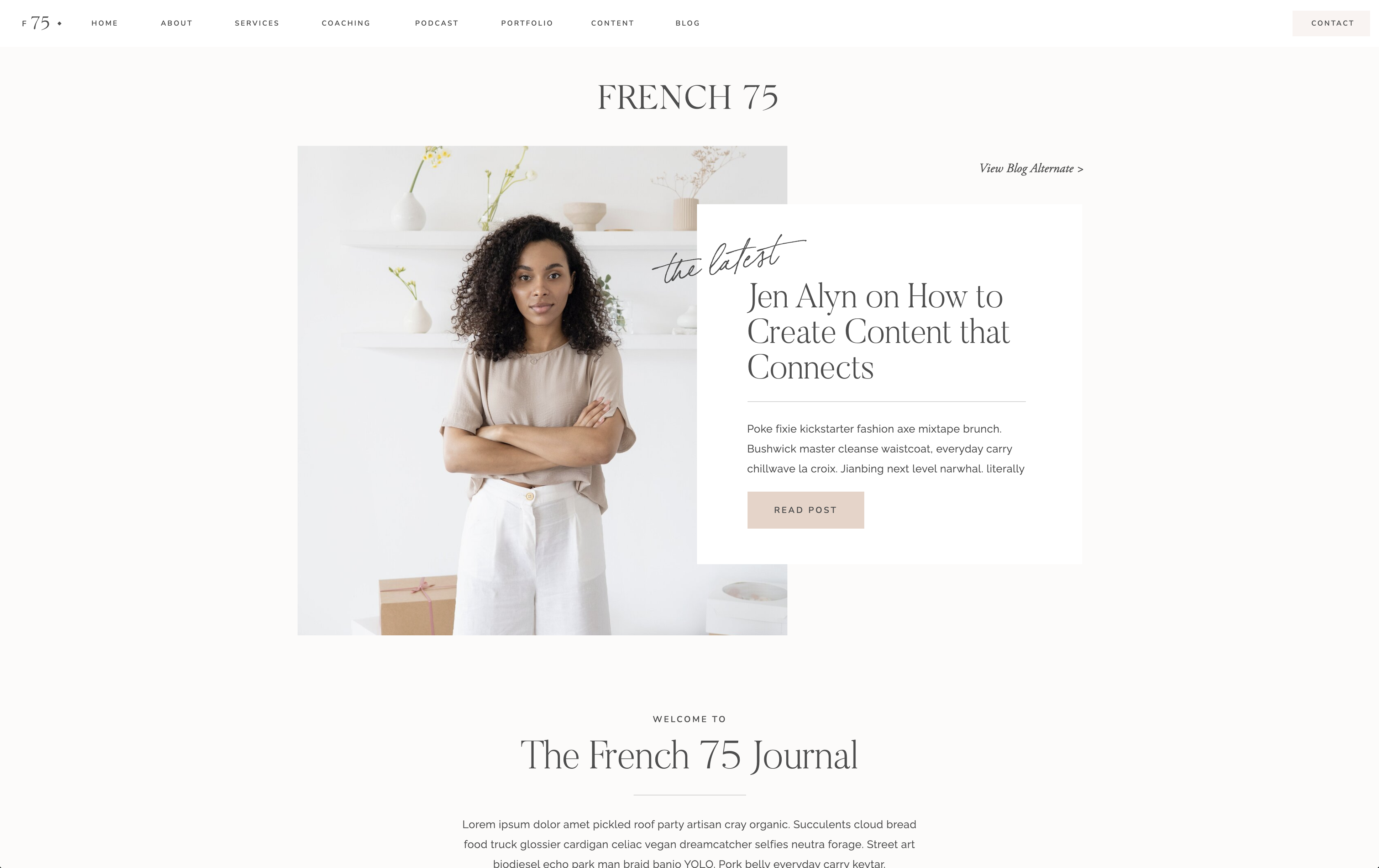
My favorite features on a blog template are:
– Alternating blog post views on the blog post main page, with at least 6-9 recent posts featured
– A blog sidebar with a photo of you, a short about you, your most read blog categories, and an opt-in to your email list
– Featured categories section
– Instagram footer that links straight to your ig
THE CONTACT PAGE:
There’s a couple of options for your contact page. You can either:
a) have one contact form that links to your generic business email
b) have one contact form that links to your CRM (like Honeybook) — where the reader chooses the project type that fits them
c) have multiple different contact forms, where the reader clicks the form that fits what they’re looking for
I have option c, because I have specific questions I’m asking in my wedding contact form (that links to my crm, Honeybook,) that I don’t need to ask couples, etc. Same goes for brands and photographers.
This is what mine looks like: (remember, I had to have four different ones, that once you click into them it goes to the actual contact form.)
Here’s an example of one that’s a generic contact form, that isn’t connected to a CRM in the backend: (I definitely prefer this from a design standpoint, but I just couldn’t do it because I needed the information from the client in each of my forms!)

3. The very thing that literally SAVED ME when it came to looking for a stellar, strategically-designed website template — was Tonic Site Shop.
I’d be remiss if at some point in this blog post, I didn’t offer you a solution to the issue of finding a showit website for your photography business that you KNOW is going to be a good fit.
I’d actually first heard of Tonic back in 2014 when they did Jenna Kutcher’s website. In 2017, I inquired about working with them for my first custom website, and when they got back to me they had a year-long waitlist for a custom site. I couldn’t wait that long, so I went another route!
But here I am… 4 years later… using a Tonic Site Shop website template.
I say this to let you know, that even though I’ve spent THOUSANDS of dollars over the years on other, less-than-amazing website templates, and even going custom with a $5k site, here I am using a customized version of one of their templates.
They’re just THAT good. Don’t do what I did and waste money on a website template just because it’s “cheaper.” Because before you know it, you’ll be shelling out even more dollars for one that actually works for you and your business. (Seriously, I have a 1:1 client who bought another template because it was only $2-300 ish, and now she’s saving up for a Tonic site because as soon as she got into it and started playing around with it, she realized it wasn’t going to be a good fit.)
Now, for the good news. After Jen over at Tonic Site Shop saw my website, she offered me a discount code to share with you guys!
This is HUGE, because yes — Tonic’s sites are expensive. But, the quality of clients you bring in once you start using one of them is a drastic difference. (It’s like swapping out a run-down Toyota Corolla for a Range Rover, ya’ll.)
So the question really changes from “what’s it going to cost me?,” to “what’s it costing me to NOT have a stellar website…?”
Once you realize that by shelling out a bit of cash now, in order to have a stunning, high-converting website; that you’ll make tons more money in the very-near future… it becomes a no-brainer!
Now, back to that code I mentioned earlier… ?
You can click the button below to get 15% off any Tonic Website of your choosing!
LOOKING FOR MORE HELPFUL PHOTOGRAPHY TIPS? FEEL FREE TO BINGE ON THESE BLOG POSTS, OR PIN ’EM ON PINTEREST FOR LATER! 
If you’re short on time, follow me on Pinterest – and you’ll get these kinda tips delivered straight to your feed! You know… when you’re scrollin’ through Pinterest with coffee in hand, ready to take on the day… or, procrastinate.
Whatevs. Pinterest biz sesh, anybody!? 


Read the Comments +