A lot of photographers have websites, but not all of them have a website that converts their browsers into buyers.
In fact, you might even be reading this blog post because you’ve noticed your website isn’t doing its dang job, and you’re just not sure where you went wrong or how to fix it.
Luckily for you, this is one of my all-time favorite topics. So, today we’re going to audit your site and make sure you’ve got the right sections goin’ on so you can close your laptop at the end of the day knowing your website can pick up the slack as your sales secret weapon.
We’ve got 3 parts of your website to cover, and as we do make sure to keep a running checklist of changes you need to make along the way of after you’re done!

Tip 1: Your Website Needs A Clear & Compelling Headline
As a photography biz coach, one of the things I help my clients with is developing their taglines for their photography business, which we then translate to their website.
Because, here’s the thing — you have about ten seconds from the time your potential client lands on your website to capture their attention before they peace out.
This means that the very first line on your website needs to capture their attention and be crystal clear AKA easy for them to understand.
So, it’s a pretty big deal.
How to Create Your Tagline
While there are lots of ways to create a tagline, one of my favorites is by revealing the transformation they’ll experience by working with you.
Here’s a formula you can use:
Helping [ who you help ] achieve [ what they want most ] without the [ whatever they’re trying to avoid].
For example:
I help busy photographers turn their website into a sales-converting secret weapon so they can book more clients without working 24/7.
Your turn! Comment below and let me know what you come up with.
Now that we’ve got a tagline nailed down, we want to make sure we optimize our website’s prime real estate and pop it “above the fold”.
This term comes from the newspaper industry and describes the text that you see when a newspaper is folded in half (face up). All the important headlines and attention-grabbing stories are still visible so you snag the newspaper and keep reading.
Here’s an example of a brilliant tagline and above the fold placement:
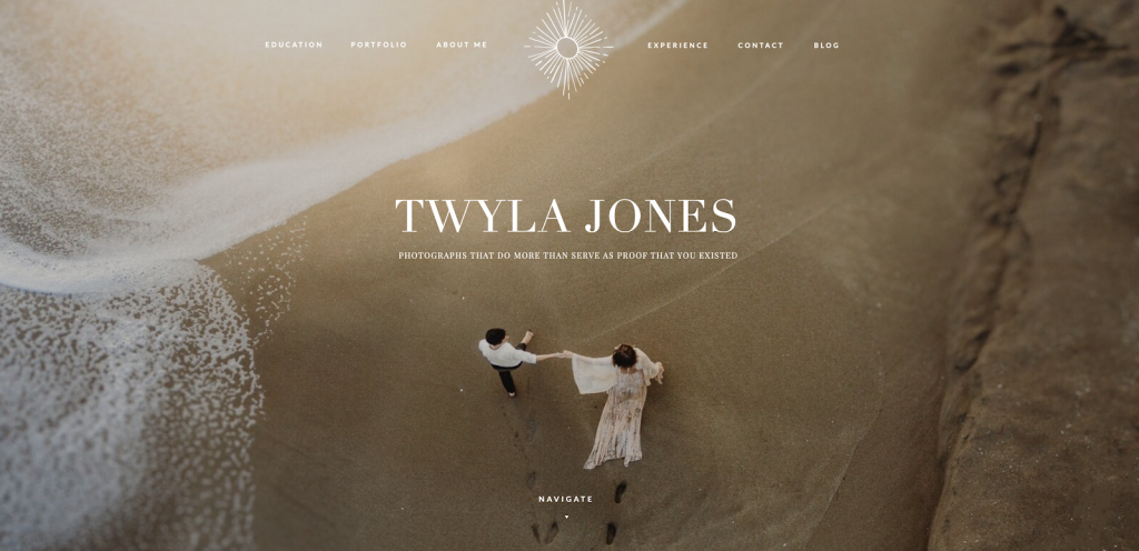
Takeaways:
1) Create your clear and compelling tagline.
2) Place it above the fold.
*Chef’s kiss*
Tip 2: Optimize Your Call-to-Action Buttons
One of the most common mistakes people make when they create their website is that they forget their call-to-action buttons.
Ya know, the buttons you click to “book/buy” a product or service.
How can you expect your reader to engage with you if you hide the dang button, am I right?!
So, here are all the places where your call-to-action buttons should live on your website’s homepage. Jot ‘em down.
- Under your tagline and above the fold.
- In the top right-hand corner of your website
- Under every major section of your website
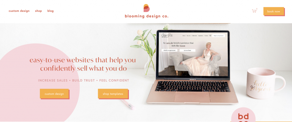
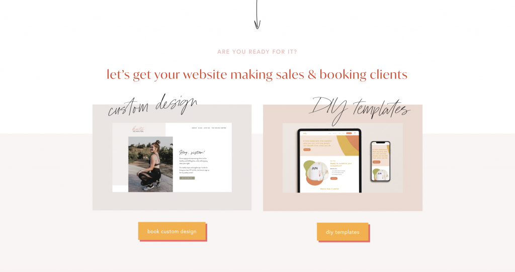
All those yellow buttons on her site are her CTA’s, and they’re strategically placed so her reader can easily take action when they’re ready to buy.
Takeaway: Make sure your CTA buttons are in 3 major places:
– top right-hand corner of your website
– under your tagline and above the fold
– under every major section
Tip 3: Type like you talk
I know this tip sounds simple, but you’d be surprised, my friend.
I’ve lost count of the blog posts and even captions I’ve read where I find myself looking up words that were probably used so the author sounded smarter (guilty).
So, when I say, “write like you talk”, I literally mean: write the way you’d speak to a friend, contractions and all.
Trade “cannot” for “can’t” and “do not” for “don’t”, is what I’m trying to say. Don’t catch your reader off guard by trying to sound like something you’re not.
This will also help them get a taste for your personality, too. Be the same person on your website as on the discovery call they’ll talk to you on.
Takeaway: Talk to your readers like they’re a friend, contractions and all.
If you’re really struggling in your business, book a free clarity call with me, (no strings attached,) for me to help you pinpoint your biggest roadblocks.
Then, if you decide it’s a fit and you NEED us to work together stat, we can totally proceed with a mentorship and get this education party started! ?
I wholeheartedly believe that if you’re here and reading this page, it’s not by accident, girl. I’ve been praying for this years mentoring clients, and for God to truly equip me with the knowledge and resources, tailored just for you, to project you into your next season and help you to be more confident – because THIS is your year.
It’s time. No more excuses. Let’s do this, and rise up to who God has called us to be in both our lives and businesses. ??
Looking for more helpful photography tips? Feel free to binge on these blog posts, or pin ’em on Pinterest for later! ??
If you’re short on time, follow me on Pinterest – and you’ll get these kinda tips delivered straight to your feed! You know… when you’re scrollin’ through Pinterest with coffee in hand, ready to take on the day… or, procrastinate.
Whatevs. Pinterest biz sesh, anybody!? ??


Read the Comments +